

Colours "go together" for two reasons: they either sit in a harmonious relationship on the colour wheel, or one of them is a neutral that quietly agrees with everything. Master those two ideas — colour harmony and the anchoring role of neutrals — and you can build an outfit that looks considered without owning a single fashion textbook.
This guide gives you the formulas. You will find the neutrals that pair with anything, a plain-English version of the colour wheel, and a colour-by-colour matrix of combinations that always work — including the exact answer to what colour shirt goes with black trousers. Every block below is written to be lifted straight into your next getting-dressed decision.
First, the neutrals (your free colours)
Before any colour theory, understand neutrals — because they do most of the heavy lifting in a well-dressed wardrobe. Neutrals are the shades with no strong hue of their own, which is precisely why they get along with everything.
Your core neutrals are white, black, navy, grey, beige/camel, brown and denim. The rule: neutrals go with every colour, and they go with each other.
- White — the cleanest reset. Sharpens bright colours, softens dark ones, and lifts every other neutral.
- Black — grounds and formalises. Makes accent colours look more graphic and deliberate.
- Navy — behaves like a softer, more modern black; the single most versatile colour you can own.
- Grey — the diplomat. Cools warm colours down and reads quietly expensive with anything.
- Beige / camel — warm neutrals that flatter skin and make bright colours look richer.
- Brown — the "new black" for warm dressers; earthy and grounding without the starkness.
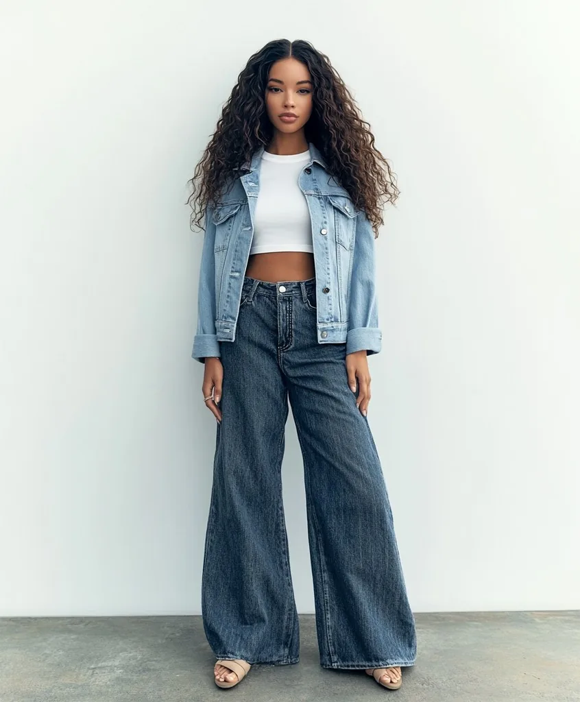
- Denim — mid-blue denim functions as a neutral and pairs with almost anything you own.
Practical upshot: if you build a wardrobe of neutral basics, every accent colour you add automatically has something to pair with. Neutrals are the free colours that make the rest of your wardrobe work.
The colour wheel, simplified
The colour wheel is just the rainbow bent into a circle, with the primary colours (red, yellow, blue), the secondaries they mix into (orange, green, purple), and the shades in between. You do not need to memorise it — you only need four relationships that reliably produce colours that go together.
Complementary — opposite the wheel
Complementary colours sit directly across from each other: blue and orange, purple and yellow, red and green. Because they are opposites, they create the strongest contrast and make each other look more vivid. The trick is to let one lead and keep the other as an accent — think a cobalt-blue dress with rust-orange shoes, rather than a 50/50 split that can look loud.
Analogous — neighbours on the wheel
Analogous colours sit next to each other — blue, teal and green, or red, coral and orange. Because they share underlying pigment, they blend into a calm, harmonious look with no jarring contrast. An outfit of olive, mustard and rust is a classic analogous grouping: rich, easy on the eye, and hard to get wrong.
Monochromatic — one colour, many depths
A monochromatic outfit uses a single colour in several shades — pale blush, dusty rose and deep berry, all in the pink family. It reads as polished and intentional because everything obviously belongs together, and the variation in depth keeps it from looking flat. Tonal dressing like this is one of the most reliably elegant looks available.
Triadic — three, evenly spaced
Triadic combinations use three colours evenly spaced around the wheel — such as a primary trio of red, yellow and blue, or a softer, muted version in dusty rose, ochre and slate blue. It is bolder and more playful, so the safest way to wear it is to let one colour dominate and use the other two as smaller accents in a bag, shoe or scarf.
Foolproof colour pairings, colour by colour
This is the heart of the guide. Each block below takes one anchor colour and lists the combinations that always work, with a one-line reason for each. Treat them as a lookup: find the colour you are building around, and pick a partner from its list.
Black is the ultimate anchor: it pairs with almost everything and makes accent colours look graphic. Best combinations:
- Black + white — the timeless high-contrast pairing; crisp, clean, works for any occasion.
- Black + camel — warm-meets-dark; instantly looks expensive and softens black's severity.
- Black + red — bold and confident; red pops sharply against black without clashing.
- Black + emerald or forest green — jewel tones glow against black for an elevated evening look.
- Black + blush pink — the softness of blush takes the hard edge off black; modern and flattering.
- Black + denim — a black top with mid-blue jeans is the easiest off-duty combination there is.
What colour shirt goes with black trousers?
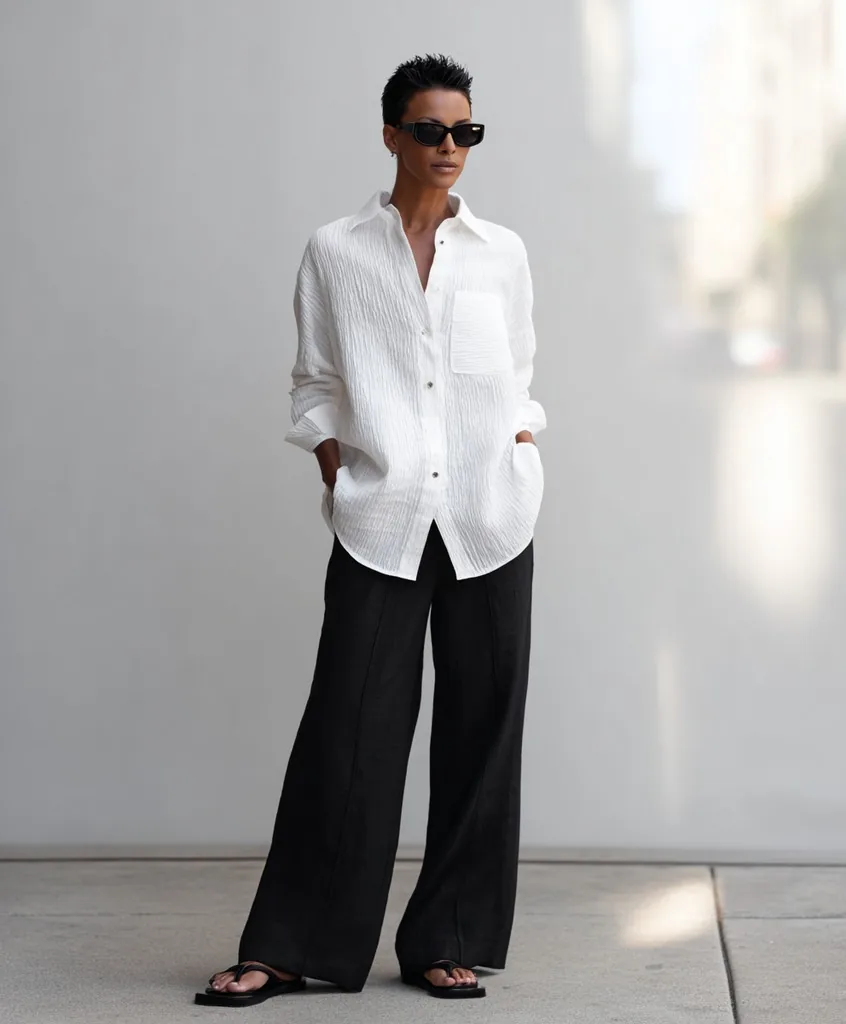
Almost any, which is why black trousers are a wardrobe staple. The safest choices: a white shirt (crisp and classic), a pale blue shirt (softer, still office-ready), grey (quiet and tonal), or a blush-pink shirt (warm and modern). For contrast, a burgundy or emerald shirt looks rich against black; for an all-dark look, a black shirt with black trousers reads sleek as long as you vary the texture.
White is the clean slate that brightens whatever it touches. Best combinations:
- White + navy — the nautical classic; fresh, sharp and endlessly wearable.
- White + black — maximum contrast, maximum polish.
- White + denim — a white shirt and jeans is the definitive effortless outfit.
- White + any bright — red, cobalt, fuchsia or yellow all look their most vivid against white.
- White + tan/camel — soft, summery and quietly luxe.
Navy is the colour that goes with everything — a softer, more flattering stand-in for black. Best combinations:
- Navy + white — clean and crisp; the most reliable navy pairing.
- Navy + camel — a menswear-inspired classic that always looks refined.
- Navy + blush or pink — the coolness of navy makes pink look grown-up, not sweet.
- Navy + grey — two neutrals for a quiet, tailored, tonal look.
- Navy + burgundy — two deep tones that feel rich and considered together.
- Navy + mustard or gold — a warm accent that lifts navy beautifully.
What colour goes with everything?
Navy is the closest thing to a colour that goes with everything: it behaves like a neutral, flatters most skin tones, and pairs with every other colour while feeling softer and more modern than black. Grey and camel are the close runners-up — between navy, grey, camel, white and black you have a foundation that matches virtually anything else you own.
Grey is the neutral diplomat; it takes on the mood of whatever you pair it with. Best combinations:
- Grey + white — light, clean and understated.
- Grey + black — sleek and urban; keep some contrast between the shades.
- Grey + blush pink — soft and pretty; grey keeps pink from feeling too sweet.
- Grey + yellow — a fresh, cheerful contrast that stops grey looking flat.
- Grey + burgundy or plum — deep jewel tones warm grey up for autumn and winter.
- Grey + navy — a quietly expensive tonal combination.
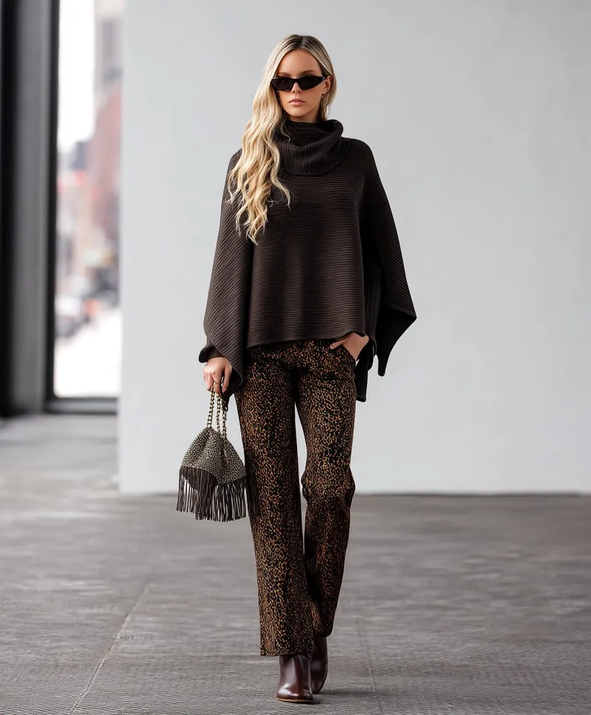
Beige and camel are warm neutrals that flatter the skin and make brighter colours look richer. Best combinations:
- Camel + white or cream — soft, luxe and effortless; a tonal warm-neutral pairing.
- Camel + black — the classic high-low mix of warm and dark.
- Camel + navy — polished and menswear-inspired.
- Camel + burgundy — autumnal and rich; two warm depths that harmonise.
- Camel + emerald or olive — earthy green makes camel look expensive.
- Camel + denim — relaxed and easy for everyday.
Brown is the warm anchor that has replaced black for many modern wardrobes. Best combinations:
- Brown + cream or ivory — warm, soft and quietly luxurious.
- Brown + denim — earthy and casual; a chocolate knit over blue jeans is foolproof.
- Brown + camel or tan — tonal brown dressing looks rich and deliberate.
- Brown + pink or blush — an unexpectedly modern, flattering contrast.
- Brown + olive green — two earth tones that were made for each other.
- Brown + burnt orange or rust — warm analogous shades for a cosy, autumnal look.
Olive green is a warm, earthy near-neutral that pairs far more widely than people expect. Best combinations:
- Olive + white or cream — clean and fresh; lightens olive's depth.
- Olive + camel or tan — earthy and harmonious; a warm tonal pairing.
- Olive + black — grounded and a little utilitarian in the best way.
- Olive + burgundy or plum — deep, moody and rich for cooler months.
- Olive + rust or mustard — an analogous grouping that feels effortlessly considered.
- Olive + denim — the easiest casual pairing for everyday.
Burgundy is a deep, wine-red that behaves almost like a warm neutral. Best combinations:
- Burgundy + camel or tan — the definitive autumn pairing; warm and refined.
- Burgundy + navy — two deep tones that read rich and grown-up together.
- Burgundy + grey — burgundy warms grey up and adds depth.
- Burgundy + cream or white — crisp contrast that keeps burgundy from feeling heavy.
- Burgundy + olive or forest green — jewel-toned and seasonal.
- Burgundy + blush pink — a tonal red-family pairing that looks soft and modern.
Blush pink is a soft, warm near-neutral that flatters and softens harder colours. Best combinations:
- Blush + grey — quiet, pretty and easy; grey keeps blush sophisticated.
- Blush + navy — navy grounds blush and makes it look grown-up.
- Blush + camel or tan — soft warm neutrals that melt together.
- Blush + white — light, clean and fresh.
- Blush + burgundy — a tonal pink-to-wine pairing that feels intentional.
- Blush + black — the soft-meets-hard contrast that keeps black looking modern.
Denim and mid-blue behave like a neutral and pair with nearly everything. Best combinations:
- Denim + white — the definitive fresh, easy outfit.
- Denim + black — a black top with blue jeans is effortless and modern.
- Denim + camel or tan — warm and relaxed for everyday.
- Denim + olive — two earthy near-neutrals that look considered together.
- Denim + red or coral — a warm brightener against cool blue; instantly lively.
- Denim + blush or pink — soft, pretty and casual.
Three rules that keep any outfit balanced
Knowing which colours pair is half the job; the other half is proportion and restraint. These three rules keep any combination from tipping over into chaos.
Rule 1 — Stick to about three colours. Two or three colours read as deliberate; four or more starts to look busy. Crucially, neutrals do not count toward the limit — so a navy-white-grey base leaves you room to add one true accent colour and still look controlled. When in doubt, subtract a colour rather than add one.
Rule 2 — Use the 60-30-10 proportion rule. Borrowed from interior design, it splits an outfit into a dominant colour (about 60%), a secondary colour (about 30%) and an accent (about 10%). In practice: 60% is your trousers and coat, 30% is your top or knit, and 10% is a bag, shoe or scarf. The uneven split is what makes an outfit look styled rather than matchy — equal amounts of two colours fight; a clear hierarchy resolves.
Rule 3 — Match undertones (warm with warm, cool with cool). Colours harmonise most easily when their undertones agree. Warm shades — camel, rust, olive, coral, gold — sit together happily; cool shades — navy, grey, emerald, fuchsia, icy blue — do the same. A warm mustard can look slightly off next to a cool blue-based pink, even though both are "yellow and pink". This is also the link to seasonal colour analysis: your own colouring has an undertone too, and the palettes that flatter you follow the same warm/cool logic.
Autumn colour combinations to wear now
The most reliable autumn colour combinations pair a deep, earthy anchor — chocolate, olive, burgundy, navy or charcoal — with one warmer or lighter partner such as cream, camel, rust or a jewel tone. What decides whether a combination flatters you is choosing the version of each colour that suits your colouring: earthier and golden if you are warm-toned, clearer and blue-based if you are cool.
Autumn is the easiest season for colour because the palette runs naturally deep and rich, and deep colours are forgiving to combine. These are the most dependable pairings as the weather turns, with who each one suits best and how to adapt it if it is not quite yours.
- Chocolate brown + cream — soft contrast with none of the harshness of black and white, and both colours share a warm base. Best on warm colouring of any depth. Cool-toned? Keep the chocolate and swap cream for soft white.
- Olive + rust — neighbours on the warm side of the wheel, so they blend rather than compete; a rust knit over olive trousers looks considered with no effort. Made for warm, deeper colouring (the Autumn season). If rust drains you, wear it below the waist and keep olive near the face.
- Burgundy + camel — two warm depths, one dark and one mid, which is why it reads as expensive. Suits almost everyone in some version: cool-toned people should choose a berry-leaning burgundy and a greige or taupe instead of golden camel.
- Navy + mustard — blue against yellow-orange is a near-complementary contrast, so the mustard makes navy look deliberate rather than safe. Best on warm colouring with some contrast. If mustard makes you look sallow, move it to a bag or shoe and keep navy at the face.
- Charcoal + plum — a cool, deep pairing with a quiet richness; add a crisp white shirt underneath and it becomes sharper still. Best on cool colouring with high contrast (Winter) and cool Summers.
- Deep teal + terracotta — blue-green against red-orange is a true complementary pair, softened because both are muted. Teal sits close to the middle of the warm–cool line, so it works on a wider range of people than most autumn shades; terracotta suits warm colouring best.
- Taupe + dusty rose — the soft, low-contrast autumn for people whose colouring is cool and muted (Summer). Both colours are greyed rather than earthy, so they look gentle instead of washed out.
- Camel + tomato red — a clear, warm red against a light warm neutral keeps autumn bright for warm, lighter colouring (Spring), who can look flattened by very dark earth tones.
Three things make autumn combinations work harder. First, texture: earthy colours look richest in matte, tactile fabrics — suede, wool, corduroy, brushed cotton — and the same rust can look cheap in a shiny synthetic. Second, the 60-30-10 rule still applies, and autumn anchors are ideal for the 60% because they are dark and calm; the accent is where you bring in the rust, mustard or teal. Third, you do not need a new wardrobe to switch seasons. Pair your summer pieces with one autumn anchor — a cream shirt under a chocolate cardigan, blue denim with a burgundy knit — and the outfit changes seasons with a single swap. For complete outfits built on these colours, see our autumn outfit ideas.
Match colours to your own palette
Every pairing above works as a combination in the abstract — but whether it flatters you depends on your natural colouring. The same emerald that makes one person's skin glow can drain another's; the difference is undertone and depth. This is why two people can wear the exact same outfit to very different effect.
The fix is to filter these combinations through your own palette. If you are warm-toned, lean into the warm versions — camel over grey, rust over cool pink, ivory over stark white. If you are cool-toned, the reverse. Our deeper guide, what is colour analysis, walks through finding your season and your best neutrals; and once you know which colours suit you, folding them into a coherent look is the subject of how to find your personal style. Together they turn "these colours go together" into "these colours go together and suit me".
Common colour-matching mistakes
Most colour mishaps come down to a short, predictable list. Knowing them makes them easy to catch in the mirror before you leave.
- Too many colours at once. More than three distinct colours reads as busy and unplanned. When an outfit feels "off", the fix is usually to remove a colour, not add an accessory.
- Clashing undertones. Mixing a warm colour with a cool one in the same weight — a golden mustard against a blue-based magenta — can feel jarring even when you can't name why. Keep undertones consistent.
- All neutral, no contrast. An outfit built entirely from mid-tone neutrals with no variation in depth can look flat and washed out. Break it up with a lighter or darker neutral, an accent, or a change in texture.
- Ignoring proportion. Two colours in equal amounts compete for attention. Let one dominate and keep the other as a smaller accent — the 60-30-10 rule exists to prevent exactly this.
How Stylin builds colour-matched outfits
Everything above is a system you can run in your head — but Stylin runs it for you, automatically, against the clothes you actually own. When you add your wardrobe, the app reads the colour of each piece and knows which items sit in a harmonious relationship: neutrals that anchor, accents that lift, and shades that share an undertone. It then assembles outfits that respect the three-colour limit and the 60-30-10 balance without you having to think about either.
The second layer is your personal palette. Because Stylin factors in your colouring, it does not just pair colours that go together in theory — it favours the combinations that flatter you specifically, steering warm-toned wardrobes toward their warm best and cool-toned wardrobes toward theirs. That is the same logic that underpins a capsule wardrobe: a tight set of colour-coordinated pieces that all combine. You can put the whole system to work in the Stylin app.
Frequently asked questions
How many colours should an outfit have?
As a rule of thumb, stick to about three colours in a single outfit, and neutrals do not count toward that limit. So a navy, white and grey outfit is really a neutral base you can wear all day, while adding one accent colour — say, a burgundy bag — still keeps you comfortably within three. Two or three colours read as intentional and polished; four or more starts to look busy unless the shades are deliberately tonal or you are an experienced dresser.
Do black and white count as colours?
In colour theory, black, white and grey are technically neutrals rather than true colours — they have no hue. In practice, that is exactly why they are so useful: because they carry no colour of their own, they pair with everything and with each other, which is what makes them the anchor of almost every reliable outfit.
What colour goes with everything?
Navy is the single most versatile colour in a wardrobe — it behaves like a neutral, flatters most skin tones, and pairs with every other colour while feeling softer and more modern than black. If you want a lighter option, camel and grey are close runners-up. Between navy, grey, camel, white and black you have a foundation that will match virtually anything else you own.
What is the easiest colour combination for beginners?
The easiest foolproof formula is a neutral base plus one accent colour: for example, a full outfit of camel, cream or grey, lifted by a single coloured piece such as an emerald knit or a burgundy scarf. Because the neutrals do all the coordinating, the only decision you have to get right is the one accent — and almost any clear colour looks considered against a calm neutral background.
Can you wear two neutrals together?
Yes — pairing two or more neutrals is one of the most elegant and reliable things you can do. Navy and camel, grey and white, black and beige, or denim with brown all look intentional and expensive. The only nuance is to vary the depth or add a little contrast so the outfit does not read as flat: pair a light neutral with a deeper one, or break up an all-neutral look with a difference in texture.
Can you wear black and navy together?
Yes — the old rule against it came from mid-century office convention, not from anything about the colours themselves, and it's been comprehensively ignored by tailoring for years now. The one thing to get right is intent: the pairing works when it's clearly deliberate and fails when it looks like you dressed in poor light. Make the contrast obvious rather than marginal — a genuinely deep navy against true black, ideally in different fabrics so the texture makes the distinction visible. A navy knit over black trousers reads as considered; a navy that's only a shade off black just reads as a mistake.
Do your shoes and bag need to match?
No, and matching them exactly tends to look dated rather than polished. What matters is that they belong to the same family — both warm-toned or both cool, both roughly the same level of formality, both in materials that make sense together. A tan boot and a chocolate bag sit together comfortably; a tan boot and a cool grey bag fight. The one place a deliberate match still earns its keep is very formal dressing, where a tightly coordinated shoe and bag reads as finished. Everywhere else, tying either one to a colour already in the outfit does more for the look than tying them to each other.
What colours go together for autumn?
The most reliable autumn combinations pair a deep, earthy anchor with one warmer or lighter partner: chocolate brown with cream, olive with rust, burgundy with camel, navy with mustard, charcoal with plum, and deep teal with terracotta. Wear the darker colour as the larger piece — trousers, coat or knit — and the partner as the smaller one, and choose matte, textured fabrics such as wool, suede and corduroy, which make earthy colours look richer.
What autumn colours suit cool undertones?
Cool-toned people look best in the blue-based side of the autumn palette: plum, berry-leaning burgundy, charcoal, navy, deep teal, pine green, taupe and dusty rose. Pair them with soft white or grey rather than cream and camel. Earthy warm shades such as rust, mustard and olive can still be worn, but keep them away from the face — in trousers, skirts, shoes or a bag — where they will not affect how your skin looks.
Colours that go together are really just neutrals doing the coordinating and a handful of harmonious accents on top. Stylin applies that system to your own wardrobe and your own palette, so every outfit it suggests is colour-matched to work — and to suit you.